Rhetorical Analysis Old/New Magazine
In 1988, National Geographic magazine published their 100 year anniversary celebration volume. Loaded with pictures, advertisements, and human interest pieces, this version of National Geographic was a far cry from where the magazine started. Fast forward, almost 30 years and the National Geographic most commonly shared today is not a print source at all but rather the Web page where all the content of the current incarnation of the print magazine is located, along with other features not found in the magazine and a healthy presence of cross promotion for the National Geographic television channel. It’s no surprise that a magazine has undergone change in a 128 year run, but the ways in which it has morphed go beyond obvious visuals.
If you were to strip the covers off of the 1888 issue of National Geographic and a current copy of the same magazine, and then place them side by side, the details to put them in the same category of periodical would be few and far between. The 1888 issue begins with an announcement of intent in which they put forth their mission statement as being one to expand geographic knowledge and encourage geographical interest in, not only geographers, but the wider populace. Yet, as we turn the pages, past the stark bold capital letters of “THE NATIONAL GEOGRAPHIC MAGAZINE,” the majority of the content from 1888 to 1896 is written in a long text form comparable to that of a textbook with few pictures and diagrams. The pictures we do encounter are usually that of maps, hand drawn scenes, and an occasional landscape. Until 1896, there were no ads or pictures of people to be found.
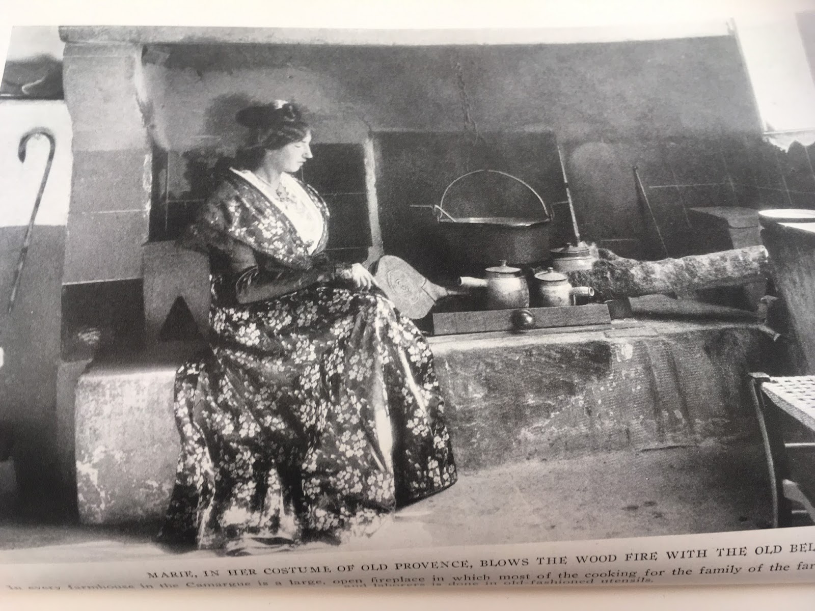
Image taken from 1922 volume of National Geographic Magazine.
|
Despite the mission statement of the magazine, the general layout and tone of the articles of 1888 appear to be geared towards an academic set and the community of scientists and elite that would find stories about world travel and issues a novelty. The first issue has a lengthy section about the National Geography Society members and officers, annual report of secretary and of treasurer, by-laws, and abstract of minutes. In this regard, the first issue and several issues afterwards function as a specialty “club magazine” geared almost exclusively towards that narrow focus. The magazine is clearly, and has always been geared towards those with an interest in nature. Yet, what has changed since the initial issue are the images, articles, and focus to that of a magazine concerned with not only nature, but nature’s relation to the human beings that interact with it. The pictures of the current issue now feature people, and sometimes are even taken by readers of the magazine. The distance at which the original issue held its audience has closed, and now the public that National Geographic wishes to address is within the pages of the magazine and reflected from cover to cover.
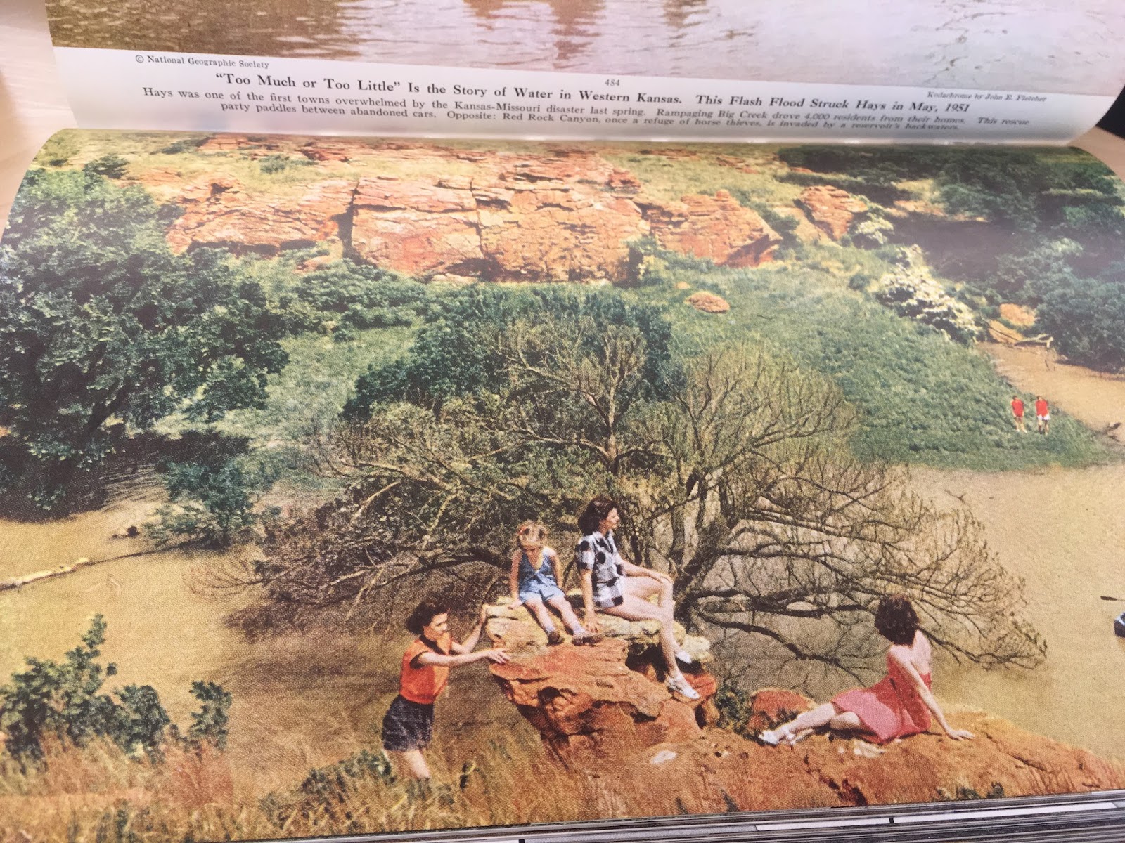
Image taken from 1952 volume of National Geographic Magazine.
|
The articles themselves in the first edition and the most recent of National Geographic show the difference with regards to audience as well. In the first few issues from 1888 there are articles such as: “The Classification of Geographic Forms by Genesis,” “The Rivers and Valleys of Pennsylvania,” “West Indian Hurricanes and Other North Atlantic Storms,” and “The Panama Canal Route.” When compared with the new edition, the lackluster appeal of those articles to a broader populace is clear. Pieces in the current National Geographic edition include a pictoral essay on a wedding in Saudi Arabia, an article on classic art pieces painted with ground mummy remains, conservation stories about vanishing aquarium fish and rhino horn harvesting, and an article called: “Can the Selfie Generation Unplug and Get Into National Parks?” The wider appeal of these stories lends itself to a larger audience that can access the Web site and share these stories without necessarily knowing much, if anything, about geography.
The new magazine content also includes both longer pieces and shorter reads mixed in with designated columns. It features a video of the day, picture of the day, and a high focus on pictures of all kinds. There are still some use of maps in the new edition, but where they are used it is with focused and aware placement. The 1888 version included maps without clear use and no variance from long essay format. The new version also has an emphasis on cross marketing their articles with their TV channel and the print version of the magazine. Some content on the Web site is not available elsewhere at all, forcing readers to interact with the content on the site if they want to access a particular article.
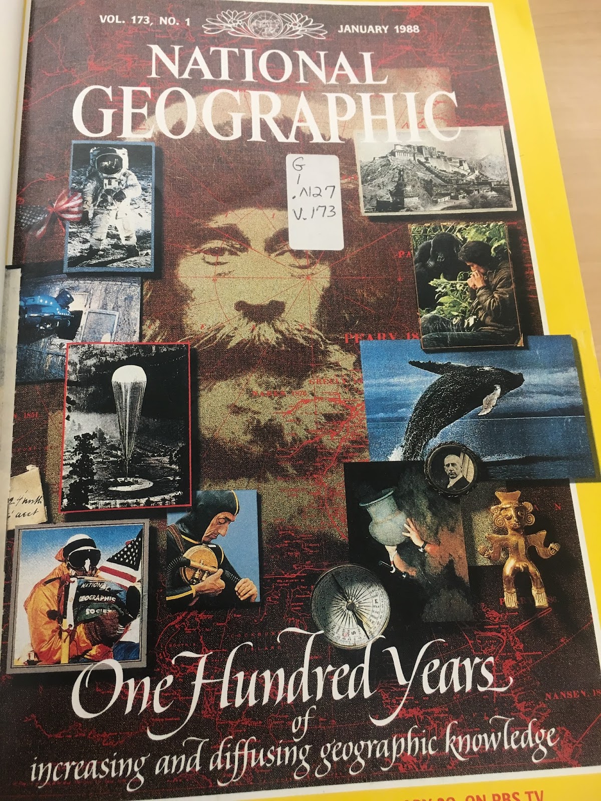
One hundred year anniversary cover of National Geographic, 1988.
|
The use of ads is another area where the two magazine versions differ greatly. In the 1888 version, there are no ads at all. Not until 1896 when the clear shift in focus happens, do we see ads, pictures of people, and the move towards appealing to the public happen. The 1896 issue breaks through the old model of the magazine further with an essay contest for high school students in the back of the magazine, calling for an essay no longer than 2,000 words on “Mountain Systems of the United States.” One ad in the back of this issue is for a dry goods store called “Woodward and Lathrop.” Several of the advertisements deal with railway routes. One, in particular, advertises a railway line with the “only solid vestibuled train, electric-lighted, steam-heated with through dining car.” Yet, another advertises the “number six new model” Remington typewriter. The ads show a kind of tentative step into making this a line of funding for the magazine, but as they are lumped in the back of the magazine, it seems they aren’t sure what to do with them quite yet.
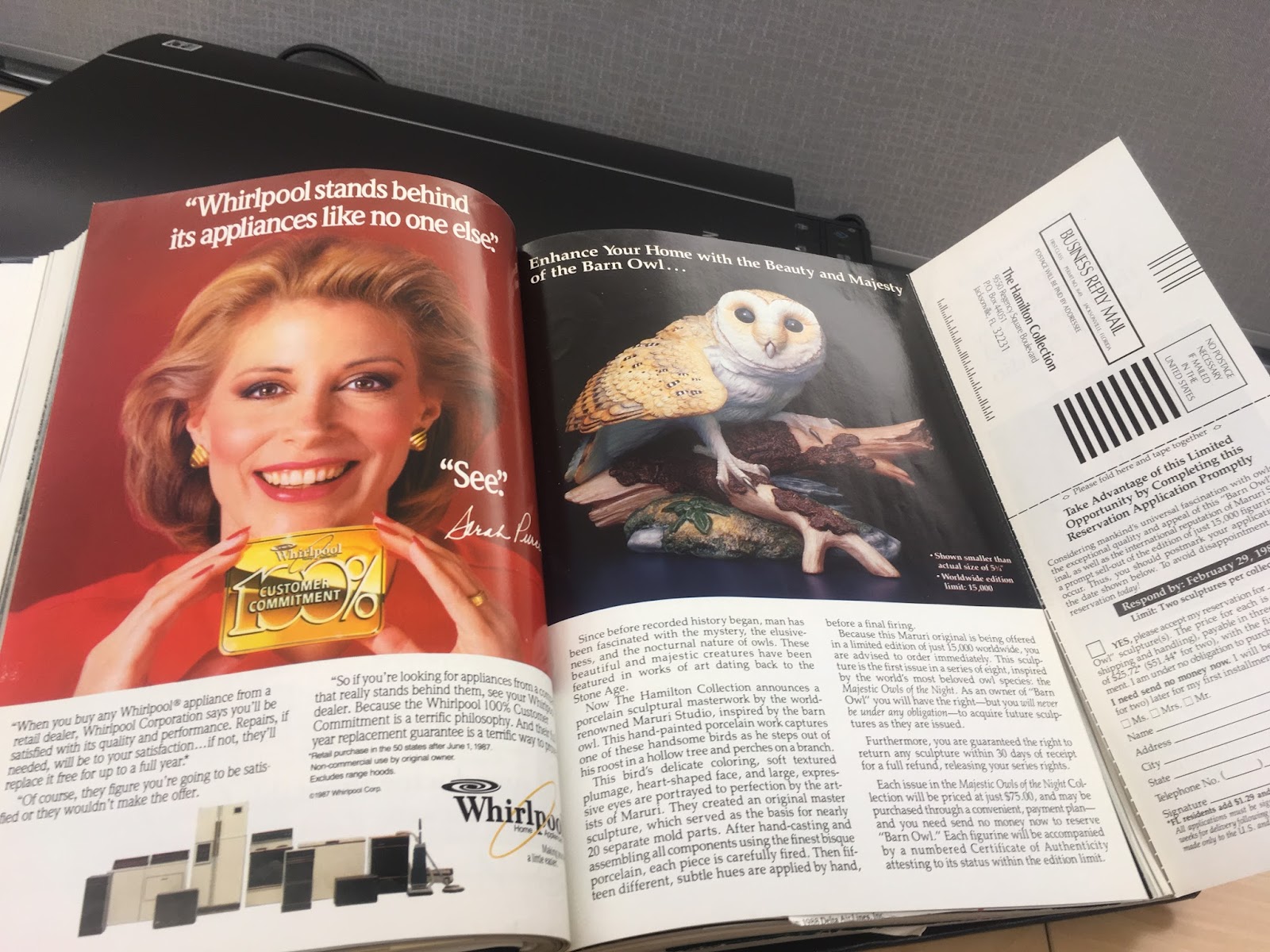
Ads from 1988 copy of National Geographic.
|
A look at the 1988 version of the magazine and the periodical in present form show that National Geographic did eventually learn how to utilize ads and their space towards an artful and complete magazine. Yet, as an indication of changes even within the last 30 years, the current version of National Geographic is not as ad-heavy as 1988 where ads were almost on every other page, and were not tied to any particular theme other than consumer culture. Today’s online version is able to space out the ads among the articles, occasionally offering pop-up ads, but with no heavy hand. The ability to rely not only on the print magazine, but also the Web site and the television channel gives this flexibility to have ads in fewer numbers. The ads that do appear in this space are seamlessly integrated as well. The two on the homepage are infused with the National Geographic logo and have the same kind of pictures that National Geographic articles feature. For example, several have landscapes in the background and text overlay that will entice the reader to click for more information. The other ads for insurance and camera/photography services are thoughtfully designed to integrate into the text of the Web site with companion language such as “call to adventure” and a nature slant towards them.
It is the ads themselves that lead to the greatest changes in style that National Geographic Magazine sees. Before the ads, the magazine relied on text to communicate its message. The text was forced to make readers pay attention to conservation, geographic landmarks, and accomplishments in the changing landscape of the world. With the introduction of ads, there also came pictures of the people doing these things, the places they were going, and the animals that needed protecting. Now, the pictures are what drives the stories and brings people to National Geographic. The magazine only became a household name because of the switch towards pictures; most especially when the magazine (in the 1950s and continuing to today) moved towards beautifully colored, larger than the page images.
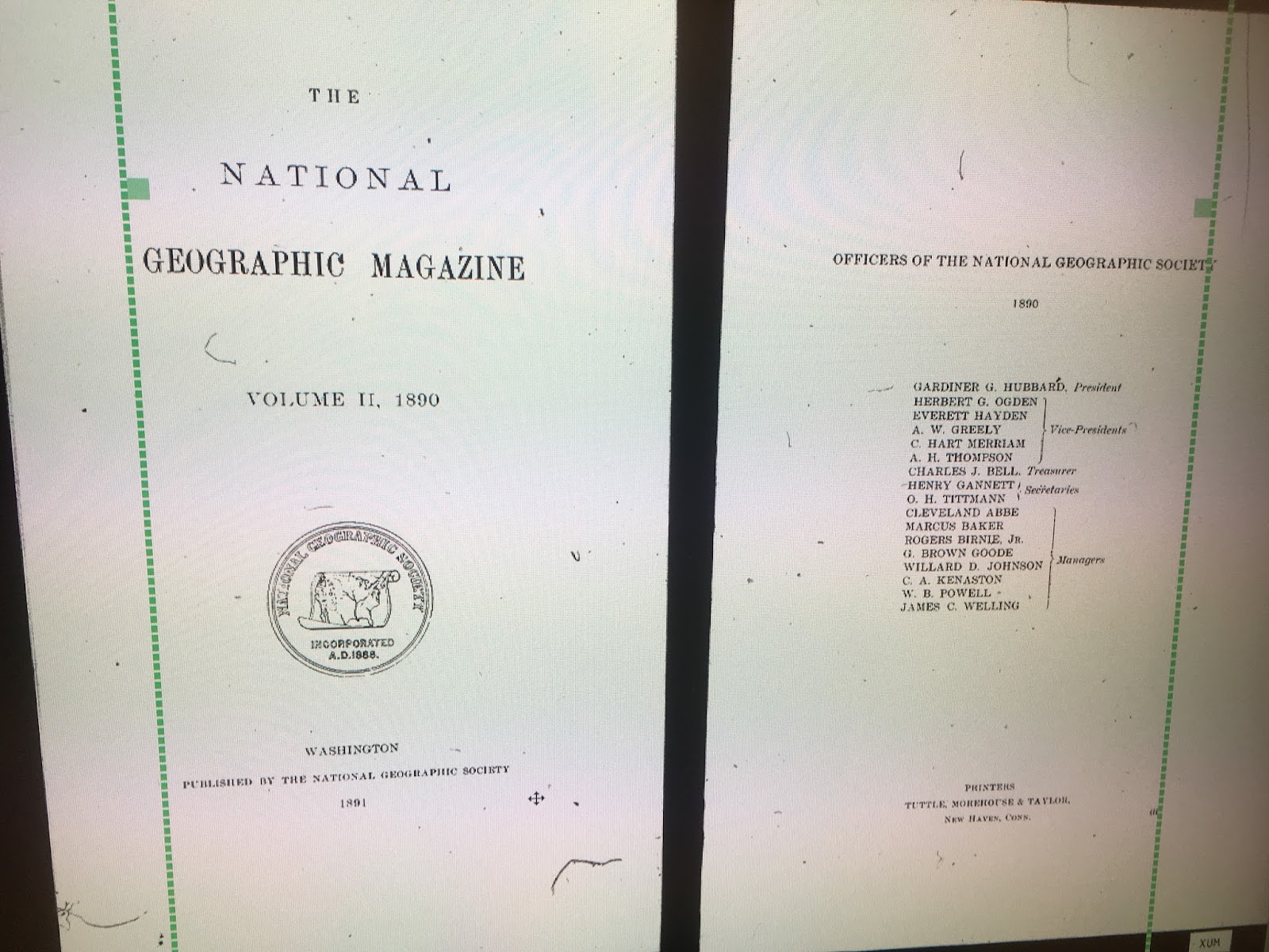
Cover page of 1890 “The National Geographic Magazine.”
|
In current culture, National Geographic is well-known as a magazine for wonderful photography. The magazine (now primarily in Web form) can tackle any issue from “the validity of the five second rule” to David Letterman talking about climate change, and as long as the photography is there to present a literal “pretty picture” then the reader does not bat an eye. The magazine sticks close to being able to tie the articles they feature back into science, nature, and geography in some way and as such the online magazine flows smoothly. Gone are the advertisements about typewriters and railway lines, and now replaced with car ads (in a 1988 issue) and computers (current issue for Microsoft) as National Geographic has evolved to further its original mission: “the increase and diffusion of geographic knowledge.”
Rhetorical Analysis Plans for Revision
For revision, I plan to rework the placement of the photos and re-evaluate what photos are used so that they match my copy better. For the first draft, I found the pictures and then wrote the analysis. Matching pictures to analysis is a better strategy that I wish to employ in revision. Further, because the material got dense at times, I have several awkward phrases that I would like to rework. I’d like to go over the whole piece and find where words are not being used as I intended, and where the abundance of words I originally used is not necessary. In short, being more precise and concise as Dr. Jones suggested. As far as organization, on my rewrite, I would like to address all the features of the old magazine and then move to modern day magazine. This will offer the greatest insight and contrast. As it stands, the jump from older magazine to new confuses the reader on what is being talked about and compared. Overall too, I’d like to find more interesting information for this piece. I was uncomfortable talking about the rhetoric portion and getting that down, and by doing so, my paper was less interesting and more technical.
No comments:
Post a Comment